
Stop playing tennis in Powerpoint!
One of the easiest ways to instantly improve your slides in your PowerPoint presentations at school, work or university, is to shorten your line lengths.It All Begins Here
It’s surely a common workplace experience to sit through a dreary PowerPoint presentation where every slide feels stuffed with too much information and simply hard to read. My least favourite are those slides where the words run from the left margin all the way across to the right, and I’m turning my head so frequently that I feel as though I’m watching a tense tennis final.
There’s unfortunately a misconception in professional settings that lots of words on the page convey intelligence, insight or thorough research. But from a professional design perspective, I need to tell you that that assumption is incorrect.
Consider this PowerPoint slide (that one below) where the text fills just one column, occupying the full width of the layout. If this was your slide, your audience would be working so hard to read all of this text and turning their heads just like they’re watching tennis! Or worse, your audience will find it too hard to read and will check out altogether. Now that is a presentation fail.
One of the easiest ways to instantly improve your slides in your PowerPoint presentations at school, work or university, is to shorten your line lengths. But “I’m not a designer” you say? “What are line lengths?” Let me explain.
The length of each line of text (the line length) would ideally be 60-80 characters including spaces. This is the ideal length as the audience doesn’t need to move their head to read each line, rather they can scan with their eyes.
“Is it so hard to move your head to read a presentation?” Actually, yeah. We human beings want to do as little as possible to receive the information and entertainment we want. Graphic design is about strategic decisions in layout, form and colour to make it easier to take in information and process it.
Shorter line lengths naturally guide the viewer’s eye and improve readability and scan-ability. This is what you want! You want your audience to take in everything you have written on the page and regard the presentation and therefore you as insightful and professional.
It’s time for a quick fix. And no, you don’t have to count the characters on each line!
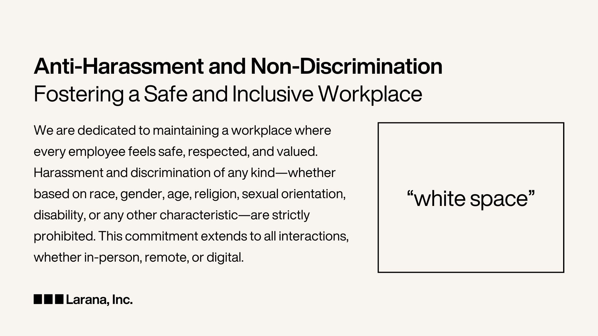
My simple tip for improving your deck is to adjust the text box width to two-thirds of the width of the PowerPoint slide.

Designer Tip for Non-Designers: Two thirds text box, one third empty space.
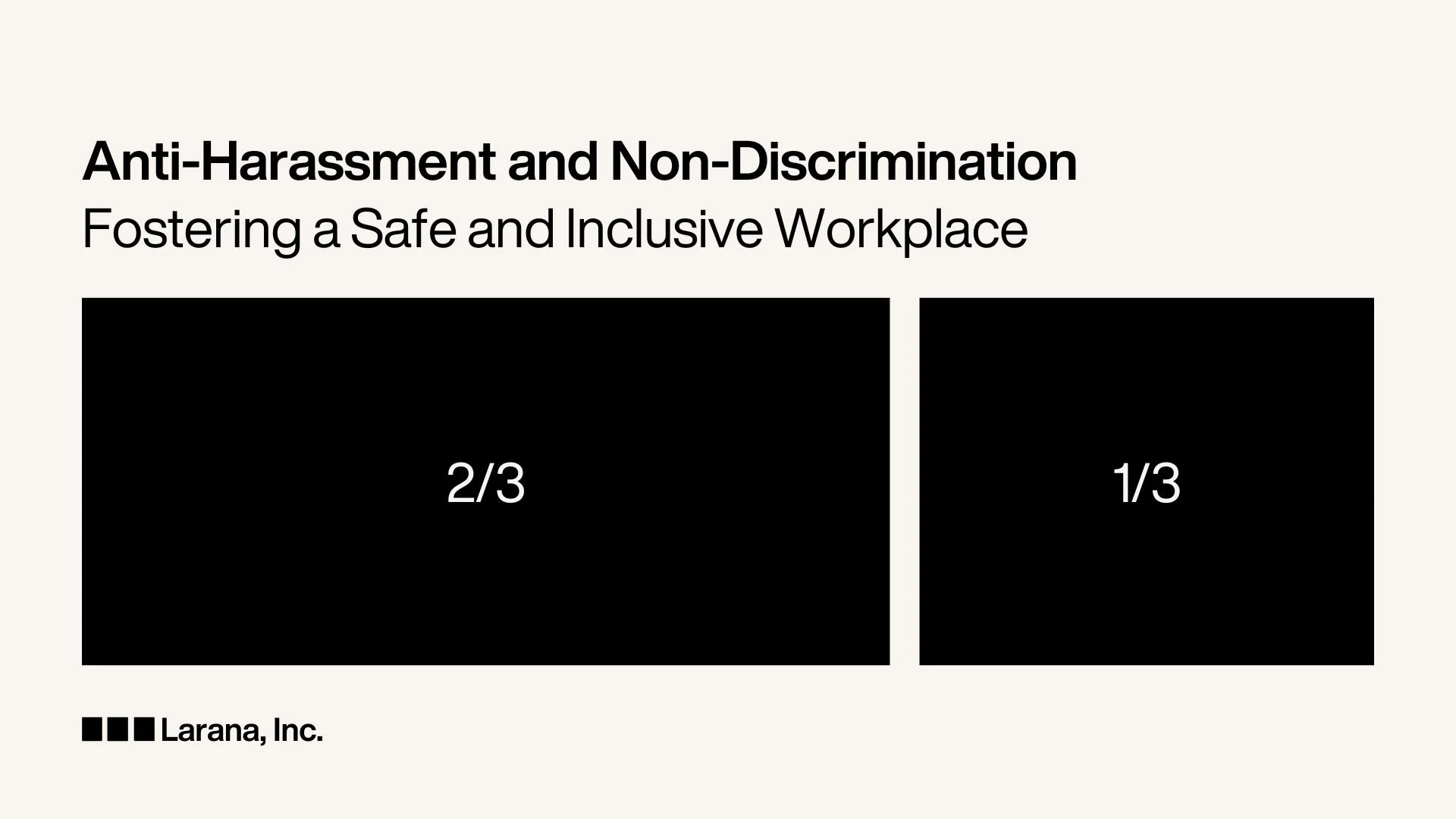
But what about that empty space? That 1/3 of your deck that’s now simply blank? That empty space is something professional designers call “white space” and it’s a good thing. Creating compelling graphic designs is about balance. If you fill every gap of a slide, poster or page with content, its clutter, even if the content is incredible. Visual clutter is a real turn off. Quite literally a turn away. When you allow “white space” or “breathing room” on your slide it adds weight to the text that is important and adds balance to the overall layout. That white space conveniently says, “don’t look over here, look over there at the compelling content”.
Reality Check: Empty space on a slide doesn’t mean you didn’t have enough words or ideas to share, rather it shows that what you have on the page is important.
To summarise:
Shorter line lengths guide the eye and make content easier to read
White space gives weight to the content that is most important to read
How to do this is make the text box just two thirds of the width of the slide. Don’t let your text run all the way from one margin to the other.
Small tweaks adjusting line lengths make a big difference in how your slides and your content are perceived. Want more easy design tips? Follow for more and check out my Canva templates to help you create impactful, professional designs without being a designer.

A beige presentation slide where the text is limited to two thirds of the slide width.